Library Management Flutter app design - CodeMub
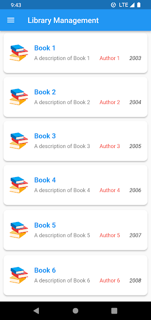
Flutter is a powerful framework for building cross-platform applications, and its flexibility comes from a rich set of widgets that allow developers to create complex and beautiful UIs. In this blog, we'll explore some fundamental Flutter widgets such as Text, Image, Column, Row, AppBar, Padding, Card, and SizedBox. We'll also dissect a code snippet that demonstrates the usage of these widgets to create a simple library management app.
Fundamental Flutter Widgets
Text Widget
The Text widget is used to display a piece of text. It allows customization of text properties such as font size, color, and style. In the provided code, the book titles, descriptions, author names, and publication years are all displayed using the Text widget.
Image Widget
The Image widget is used to display images. It supports various image sources, including network images, local assets, and more. In this example, the book cover images are displayed using the Image.asset constructor, which loads an image from the app's assets folder.
Column and Row Widgets
The Column and Row widgets are used to arrange child widgets vertically and horizontally, respectively. They allow developers to create flexible and responsive layouts. In the code, a Column widget is used to vertically arrange multiple Card widgets, each representing a book.
AppBar Widget
The AppBar widget is a material design app bar that typically appears at the top of the screen. It provides a space for titles, icons, and actions. In the code, the AppBar widget is used to display the title "Library Management" at the top of the screen.
Padding Widget
The Padding widget is used to insert space around its child. It helps in adding margins to widgets, ensuring proper spacing and alignment. In the code, Padding is used to create space around each Card widget, giving the layout a neat and organized appearance.
Card Widget
The Card widget is a material design card that represents a piece of material. It has rounded corners and can have elevation (a shadow) to create a 3D effect. In the code, Card widgets are used to represent each book, with images, titles, and additional information.
SizedBox Widget
The SizedBox widget is used to create a box with a specified width and height. It can be used to add empty space or set dimensions for other widgets. In the code, SizedBox is utilized to add vertical spacing between elements inside the Column.
Analyzing the Code Snippet
Now, let's dive into the provided code snippet:
Import Statements and main Function
import 'package:flutter/material.dart';

void main() {
  runApp(MyApp());
}
This snippet contains the import statement for the Flutter material library and the main function. The main function is the entry point of the application, and it calls runApp with an instance of the MyApp widget.
class MyApp extends StatelessWidget {
  const MyApp({Key? key}) : super(key: key);

  @override
  Widget build(BuildContext context) {
    return MaterialApp(
      debugShowCheckedModeBanner: false,
      home: MyHomePage(),
    );
  }
}
Here, MyApp is a stateless widget that returns a MaterialApp. The MaterialApp widget provides the basic structure for a Flutter application, and it disables the debug banner. The home screen is set to an instance of MyHomePage.
MyHomePage Widget
class MyHomePage extends StatefulWidget {
  const MyHomePage({Key? key}) : super(key: key);

  @override
  State createState() => _MyHomePageState();
}
MyHomePage is a stateful widget. It's responsible for maintaining the mutable state of the widget. It has a corresponding state class _MyHomePageState which extends State
_MyHomePageState Widget
class _MyHomePageState extends State {
  @override
  Widget build(BuildContext context) {
    return Scaffold(
      appBar: AppBar(
        title: Text("Library Management"),
      ),
      drawer: Drawer(),
      body: Column(
        children: [
          // Cards for displaying book information
          // (See next code snippet for detailed explanation)
        ],
      ),
    );
  }
}
The _MyHomePageState widget builds the UI for the home page. It includes a Scaffold with an AppBar (for the app title) and a Drawer (currently empty). The main body consists of a Column widget where the book information cards will be placed.
Book Information Cards
Padding(
  padding: EdgeInsets.symmetric(vertical: 1.0, horizontal: 5.0),
  child: Card(
    elevation: 3.0,
    color: Colors.white,
    shape: RoundedRectangleBorder(
        borderRadius: BorderRadius.circular(10)),
    child: ListTile(
      contentPadding: EdgeInsets.all(16.0),
      leading: Image.asset(
        "assets/book.png",
        width: 48,
        height: 48,
      ),
      title: Text(
        "Book 1",
        style: TextStyle(
          fontWeight: FontWeight.bold,
          fontSize: 18.0,
          color: Colors.blue,
        ),
      ),
      subtitle: Column(
        crossAxisAlignment: CrossAxisAlignment.start,
        children: [
          SizedBox(height: 8.0),
          Row(
            mainAxisAlignment: MainAxisAlignment.spaceBetween,
            children: [
              Text(
                "A description of Book 1",
                style: TextStyle(fontSize: 14.0, color: Colors.black54),
              ),
              Text(
                "Author 1",
                style: TextStyle(fontSize: 14.0, color: Colors.red),
              ),
              Text(
                "2003",
                style: TextStyle(
                  fontSize: 14.0,
                  color: Colors.black,
                  fontStyle: FontStyle.italic,
                ),
              ),
            ],
          )
        ],
      ),
    ),
  ),
),
Repetition of Book Information Cards
The book information cards (similar to the one in Snippet 5) are repeated for multiple books (Book 2 to Book 6) inside the Column widget in _MyHomePageState. Each card contains unique book information. This structure helps in creating a vertically-scrollable list of book information on the home page. This breakdown should help you understand the structure and functionality of the provided Flutter code.
Complete Code snippets
import 'package:flutter/material.dart';
void main() {
runApp(MyApp());
}
class MyApp extends StatelessWidget {
const MyApp({Key? key}) : super(key: key);
@override
Widget build(BuildContext context) {
return MaterialApp(
debugShowCheckedModeBanner: false,
home: MyHomePage(),
);
}
}
class MyHomePage extends StatefulWidget {
const MyHomePage({Key? key}) : super(key: key);
@override
State createState() => _MyHomePageState();
}
class _MyHomePageState extends State {
@override
Widget build(BuildContext context) {
return Scaffold(
appBar: AppBar(
title: Text("Library Management"),
),
drawer: Drawer(),
body: Column(
children: [
Padding(
padding: EdgeInsets.symmetric(vertical: 1.0, horizontal: 5.0),
child: Card(
elevation: 3.0,
color: Colors.white,
shape: RoundedRectangleBorder(
borderRadius: BorderRadius.circular(10)),
child: ListTile(
contentPadding: EdgeInsets.all(16.0),
leading: Image.asset(
"assets/book.png",
width: 48,
height: 48,
),
title: Text(
"Book 1",
style: TextStyle(
fontWeight: FontWeight.bold,
fontSize: 18.0,
color: Colors.blue),
),
subtitle: Column(
crossAxisAlignment: CrossAxisAlignment.start,
children: [
SizedBox(
height: 8.0,
),
Row(
mainAxisAlignment: MainAxisAlignment.spaceBetween,
children: [
Text(
"A description of Book 1",
style: TextStyle(
fontSize: 14.0, color: Colors.black54),
),
Text(
"Author 1",
style: TextStyle(fontSize: 14.0, color: Colors.red),
),
Text(
"2003",
style: TextStyle(
fontSize: 14.0,
color: Colors.black,
fontStyle: FontStyle.italic),
),
],
)
],
)),
),
),
Padding(
padding: EdgeInsets.symmetric(vertical: 1.0, horizontal: 5.0),
child: Card(
elevation: 3.0,
color: Colors.white,
shape: RoundedRectangleBorder(
borderRadius: BorderRadius.circular(10)),
child: ListTile(
contentPadding: EdgeInsets.all(16.0),
leading: Image.asset(
"assets/book.png",
width: 48,
height: 48,
),
title: Text(
"Book 2",
style: TextStyle(
fontWeight: FontWeight.bold,
fontSize: 18.0,
color: Colors.blue),
),
subtitle: Column(
crossAxisAlignment: CrossAxisAlignment.start,
children: [
SizedBox(
height: 8.0,
),
Row(
mainAxisAlignment: MainAxisAlignment.spaceBetween,
children: [
Text(
"A description of Book 2",
style: TextStyle(
fontSize: 14.0, color: Colors.black54),
),
Text(
"Author 2",
style: TextStyle(fontSize: 14.0, color: Colors.red),
),
Text(
"2004",
style: TextStyle(
fontSize: 14.0,
color: Colors.black,
fontStyle: FontStyle.italic),
),
],
)
],
)),
),
),
Padding(
padding: EdgeInsets.symmetric(vertical: 1.0, horizontal: 5.0),
child: Card(
elevation: 3.0,
color: Colors.white,
shape: RoundedRectangleBorder(
borderRadius: BorderRadius.circular(10)),
child: ListTile(
contentPadding: EdgeInsets.all(16.0),
leading: Image.asset(
"assets/book.png",
width: 48,
height: 48,
),
title: Text(
"Book 3",
style: TextStyle(
fontWeight: FontWeight.bold,
fontSize: 18.0,
color: Colors.blue),
),
subtitle: Column(
crossAxisAlignment: CrossAxisAlignment.start,
children: [
SizedBox(
height: 8.0,
),
Row(
mainAxisAlignment: MainAxisAlignment.spaceBetween,
children: [
Text(
"A description of Book 3",
style: TextStyle(
fontSize: 14.0, color: Colors.black54),
),
Text(
"Author 3",
style: TextStyle(fontSize: 14.0, color: Colors.red),
),
Text(
"2005",
style: TextStyle(
fontSize: 14.0,
color: Colors.black,
fontStyle: FontStyle.italic),
),
],
)
],
)),
),
),
Padding(
padding: EdgeInsets.symmetric(vertical: 1.0, horizontal: 5.0),
child: Card(
elevation: 3.0,
color: Colors.white,
shape: RoundedRectangleBorder(
borderRadius: BorderRadius.circular(10)),
child: ListTile(
contentPadding: EdgeInsets.all(16.0),
leading: Image.asset(
"assets/book.png",
width: 48,
height: 48,
),
title: Text(
"Book 4",
style: TextStyle(
fontWeight: FontWeight.bold,
fontSize: 18.0,
color: Colors.blue),
),
subtitle: Column(
crossAxisAlignment: CrossAxisAlignment.start,
children: [
SizedBox(
height: 8.0,
),
Row(
mainAxisAlignment: MainAxisAlignment.spaceBetween,
children: [
Text(
"A description of Book 4",
style: TextStyle(
fontSize: 14.0, color: Colors.black54),
),
Text(
"Author 4",
style: TextStyle(fontSize: 14.0, color: Colors.red),
),
Text(
"2006",
style: TextStyle(
fontSize: 14.0,
color: Colors.black,
fontStyle: FontStyle.italic),
),
],
)
],
)),
),
),
Padding(
padding: EdgeInsets.symmetric(vertical: 4.0, horizontal: 5.0),
child: Card(
elevation: 3.0,
color: Colors.white,
shape: RoundedRectangleBorder(
borderRadius: BorderRadius.circular(10)),
child: ListTile(
contentPadding: EdgeInsets.all(16.0),
leading: Image.asset(
"assets/book.png",
width: 48,
height: 48,
),
title: Text(
"Book 5",
style: TextStyle(
fontWeight: FontWeight.bold,
fontSize: 18.0,
color: Colors.blue),
),
subtitle: Column(
crossAxisAlignment: CrossAxisAlignment.start,
children: [
SizedBox(
height: 8.0,
),
Row(
mainAxisAlignment: MainAxisAlignment.spaceBetween,
children: [
Text(
"A description of Book 5",
style: TextStyle(
fontSize: 14.0, color: Colors.black54),
),
Text(
"Author 5",
style: TextStyle(fontSize: 14.0, color: Colors.red),
),
Text(
"2007",
style: TextStyle(
fontSize: 14.0,
color: Colors.black,
fontStyle: FontStyle.italic),
),
],
)
],
)),
),
),
Padding(
padding: EdgeInsets.symmetric(vertical: 1.0, horizontal: 5.0),
child: Card(
elevation: 3.0,
color: Colors.white,
shape: RoundedRectangleBorder(
borderRadius: BorderRadius.circular(10)),
child: ListTile(
contentPadding: EdgeInsets.all(16.0),
leading: Image.asset(
"assets/book.png",
width: 48,
height: 48,
),
title: Text(
"Book 6",
style: TextStyle(
fontWeight: FontWeight.bold,
fontSize: 18.0,
color: Colors.blue),
),
subtitle: Column(
crossAxisAlignment: CrossAxisAlignment.start,
children: [
SizedBox(
height: 8.0,
),
Row(
mainAxisAlignment: MainAxisAlignment.spaceBetween,
children: [
Text(
"A description of Book 6",
style: TextStyle(
fontSize: 14.0, color: Colors.black54),
),
Text(
"Author 6",
style: TextStyle(fontSize: 14.0, color: Colors.red),
),
Text(
"2008",
style: TextStyle(
fontSize: 14.0,
color: Colors.black,
fontStyle: FontStyle.italic),
),
],
)
],
)),
),
),
],
),
);
}
}
Complete Source Code
Output :
Conclusion
Flutter's widget-based architecture empowers developers to create expressive and responsive UIs. By understanding and leveraging widgets like Text, Image, Column, Row, AppBar, Padding, Card, and SizedBox, you can design visually appealing and interactive mobile applications. Feel free to customize these widgets further based on your app's requirements, and explore additional widgets provided by Flutter for even more possibilities.


